As promised, here are the first time-series data graphs, the average month by month violent crime index for the entire period for which I have collected/processed data. This bird’s eye view shows a mellow wave that corresponds well to the seasons. Say what you will about Chicago in February, it’s the safest time of year!

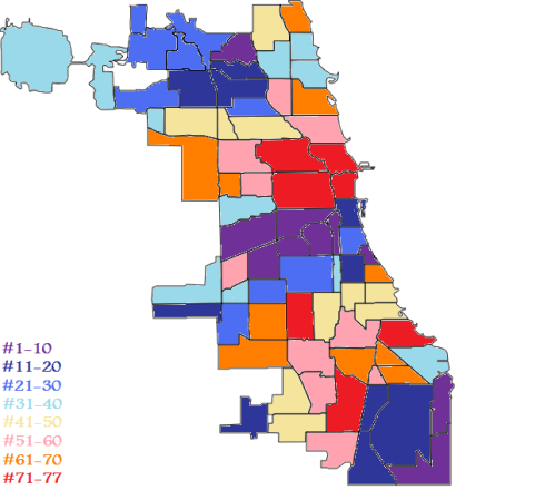
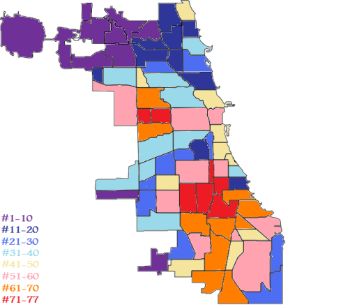
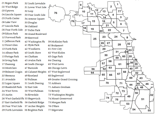
Now let’s break this single line down into several based on “side” of the city. Firstly, here is how I defined the “sides”:

And this is the breakdown:

The placement of these lines relative to each other is hardly surprising given the territories they encompass on the crime map. There is a fair degree of arbitrariness is defining geographical “sides” at all, and putting the borders as I have was largely a complete judgment call on my part. Sure, I based it on some level of rationality. I think it’s fair to say that somewhere between 75th St. and 79th St., for example, you’re far enough south to warrant being on the “Far South” side. After all, if you were that far north of Madison, you’d be in Evanston.
As a bit of an aside and a matter of forewarning, I’m going to try to keep this and blog posts generally as free of statistical gibberish as possible to keep this accessible. I’m going to as a matter of policy provide the barest minimum of explanation of the stats in the blog posts. I will hyperlink the concepts to other sites for those who want to read further as well as posting the hard numbers at the bottom of the posts. I am also turning off the moderation settings in the comments, so any real stats geeks who happen to be reading can take me to task for my amateurish methodology.
Back to the graph. It appears from the graph like the high crime areas also have more variation while the low crime areas are relatively constant. This is mostly (but not entirely) an illusion based on the range of numbers the graph is showing. There are certainly larger swings of crime in high crime areas in absolute numbers, but not really as a percentage of total crime. Using the Coefficient of Variation to take this into account, the highest crime South Side has a CoV of about 20.4%, the highest of the bunch. The second highest-crime West Side has the second lowest CoV of about 15.7%. So in actuality, taking into account that there is just more crime in certain places than others, it really doesn’t vary that much more between the various areas mapped here. They all sort of, as we saw in the first graph, roll with the seasons.
Data:
| Cent. | N. | N.W. | Far N.W. | W. | S.W. | S. | Far S. | |
| Mean | 43.32 | 19.00 | 26.44 | 14.23 | 70.87 | 25.54 | 75.04 | 47.20 |
| Standard Deviation | 7.47 | 3.36 | 4.05 | 2.44 | 11.14 | 3.92 | 15.30 | 8.25 |
| Coefficent of Variation | 17.24% | 17.71% | 15.31% | 17.16% | 15.71% | 15.35% | 20.39% | 17.48% |